The Project
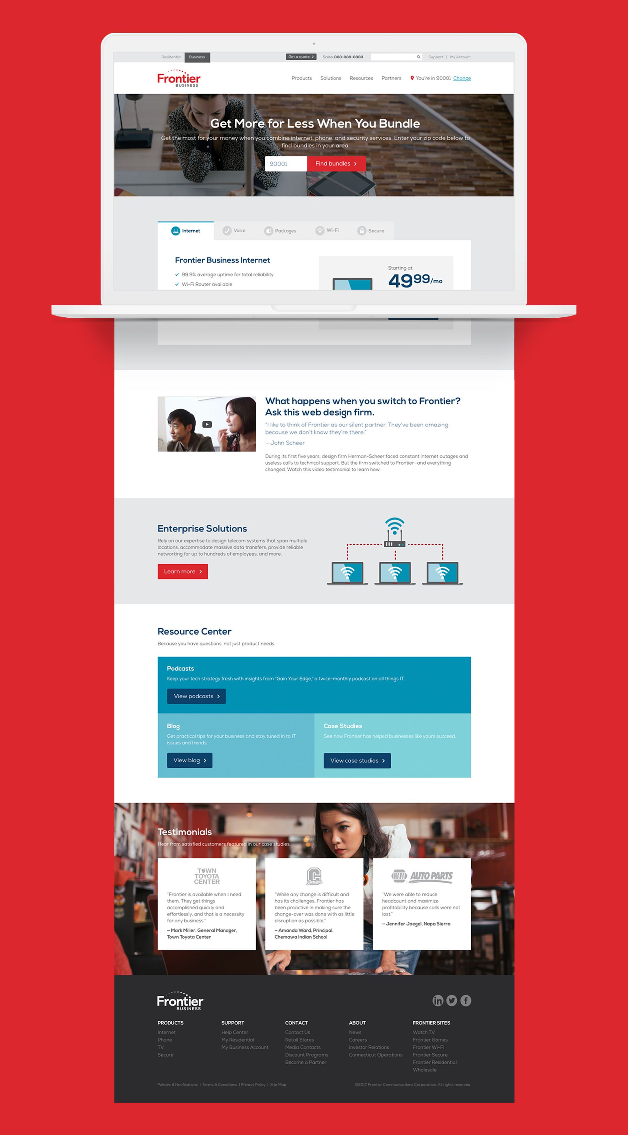
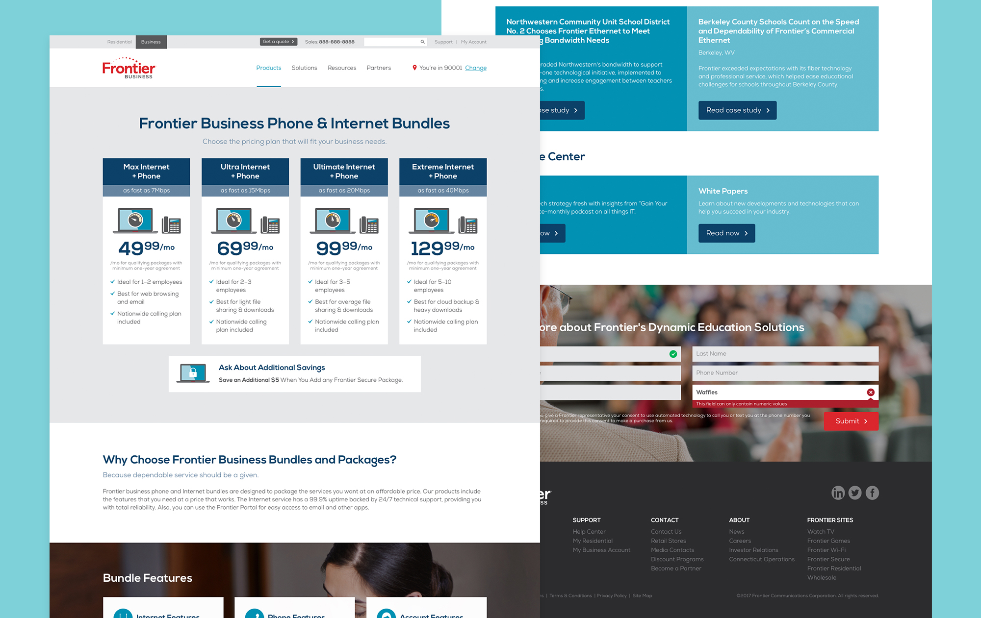
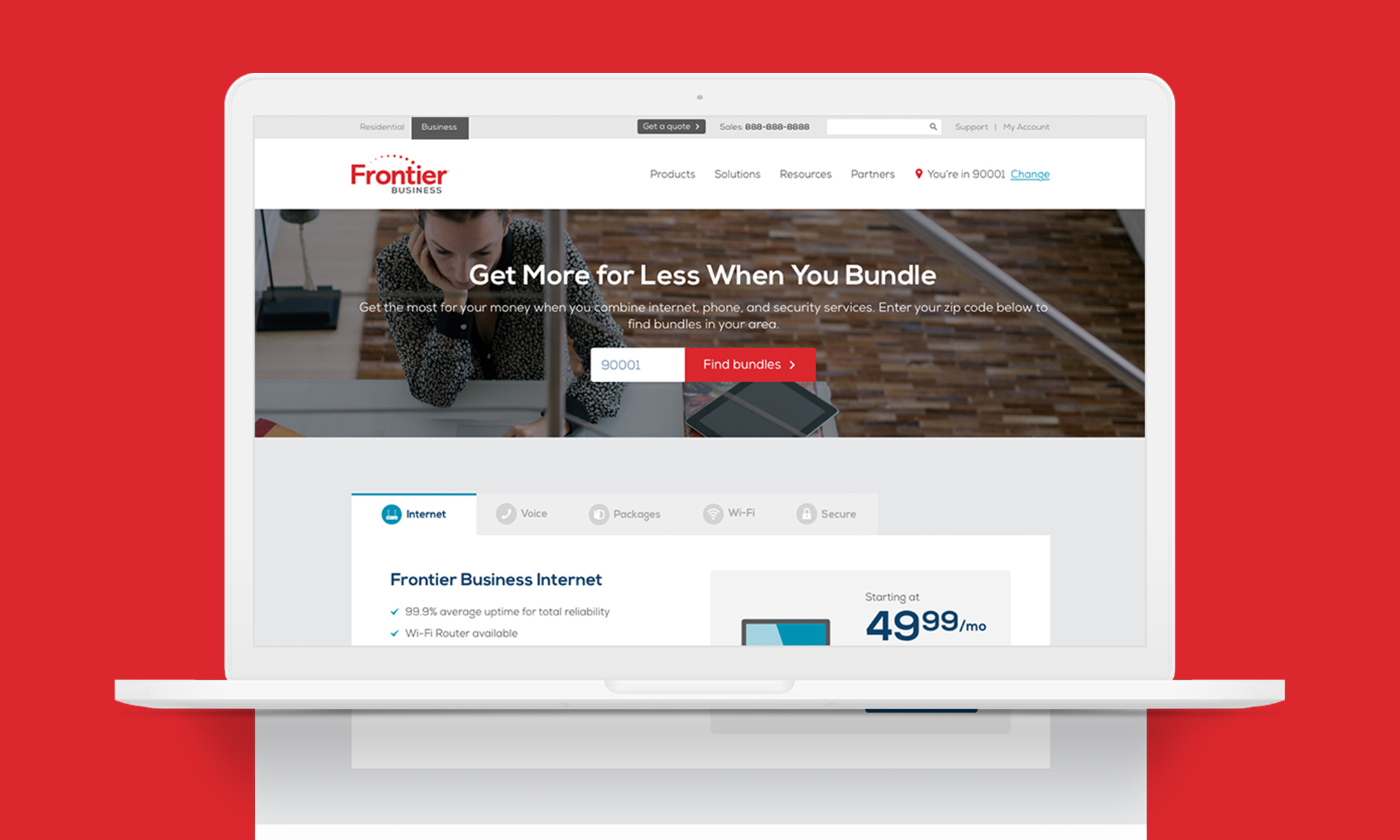
Clearlink partnered with Frontier to redesign and develop their business site that supports small to medium sized businesses. After Frontier rebranded, I proposed we update their site once again and move it into our new component system to make updates and maintenance more efficient.
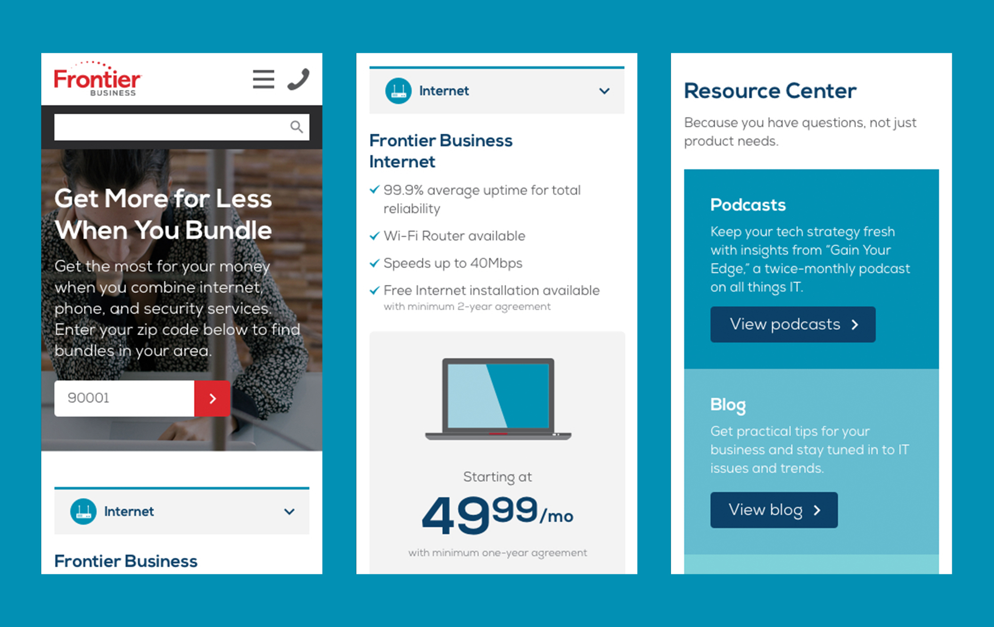
With the redesign, I also wanted to improve the mobile experience and cut down on site loading time. I updated the typographic hierarchy, made the information more visually engaging and scannable, and cut down on mobile imagery to massively improve loading time. This resulted in a 200%+ improvement on gross and net call through rate and a 178% improvement on bounce rate.
